2017 was all about safety at Made in the Shade. We focused on safety at our warehouse, safety for our crews and safety for our customers. Safety is a culture that has to be bought into in order to really implement it across the board, including our marketing. We want to be seen as leaders in safety when it comes to the emerging tenting industry. Safety is totally ingrained in our operations from the top to the bottom and it will forever be a part of how we view the work that we do.
Going into 2018, we wanted to shift our marketing focus. That is how our “THINK BIG” campaign started. THINK BIG didn’t just materialize out of thin air. It was the product of a brainstorming session we had to set the tone for the new year. We knew our jobs leading into the next year we going to be big, just like they were last year. The team came up with, “Do Big Stuff!” But that didn’t feel right. More ideas were tossed around like, “Do It Big,” or “We are Big.” It was pointed out that we needed to think about the big picture. Then BAM, Julie came up with “THINK BIG!” It was the perfect fit.
 Now that we had our focus for the year we needed to define it. To “THINK BIG,” defines how we navigate our industry and how we run our company. We look at the big picture and we focus on big events. It is no coincidence that we cover some of the biggest events in the region. To “THINK BIG” embodies how we view ourselves and how we want to be viewed by our customers.
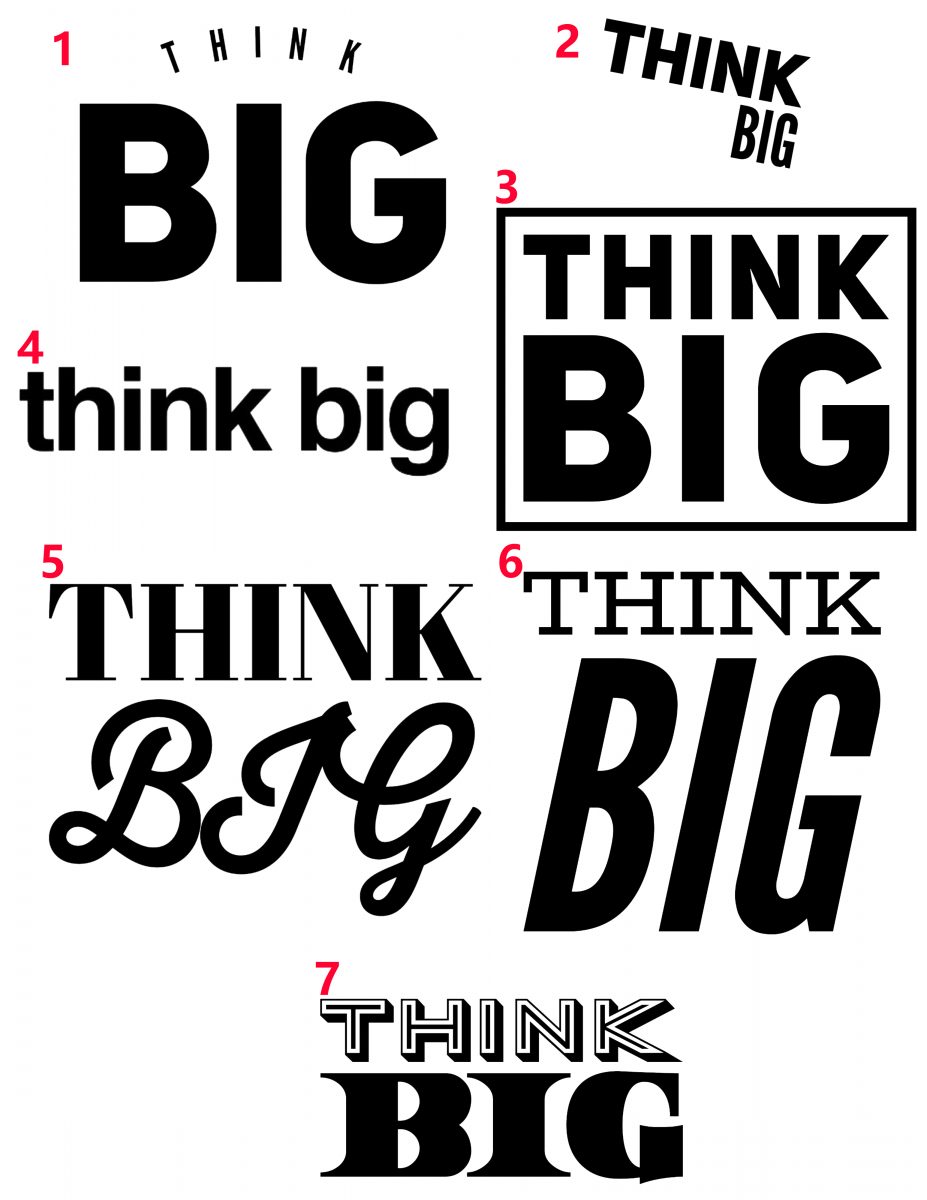
The design process is another beast unto itself. We needed to retain our current branding but show that we are thinking big. Initially, the designed started with numerous basic typography designs to complement our logo. After a few revisions and we narrowed it down to Tolyer No. 1 MEDIUM Italic font, rotated 9.52 degrees. This achieved the look we wanted. The appearance was very clean and professional. To really make “THINK BIG,” stand out we worked on exact placement around our logo. We knew it couldn’t look crowded or change the logo in anyway. Putting our heads together we came up with the plan for a splat of paint and the “THINK BIG” logo inside it. To retain some of the safety aspects of last year’s campaign, we settled on the paint being safety orange.

